Best viewed on desktop, for now.
Andreas Ubbe Dall
Product Designer
Contact

Lighthouse AI
Digital product design

Designing the eyes of the smarthome

My role

I joined Lighthouse in 2016, at a time where the app looked like the above left image. The functionality was centered around being able to see lists of videos categorized by one of three classifiers; People, pets, and other. The hardware and computer-vision needed for this functionality was well on its way, but how these might combine and manifest into a consumer product was still being figured out.

Therefore my role was to act as a conduit between all parts of the company to design for the user experience. From working closely with the founders to identify product opportunities, connecting with engineers to understand technical/hardware restraints, validating solutions, to checking in with support regularly to understand potential pain points among beta testers.

Understanding and refining the product-market fit

The original premise

People are tired of false notifications. Using depth sensing and machine learning to elimate them will be a significant add to the traditional value proposition of home security cameras.

Identifying the main target group

After speaking to users of competing products there were certainly users were fed up with false notifications, but also a significant portion to whom it didn’t matter; E.g. they live alone and any activity while they were not home was interesting to them. Therefore we decided to target busy households with pets, children, and the occasional service people, to which false or incorrect notifications were more significant.

Figuring out what happened

Taking a more natural approach

In these busy households, the datasets became increasingly complex, with lots of people and pet activity. One of the most pervasive challenges was how to take this data and condense it into something digestable, both for when you’re looking for something specific but also for presenting users with insights.

Early explorations followed more traditional patterns of filtering via “knobs and levers”. After leading brainstorming and prototyping sessions with key stakeholders, another approach was adopted - what if you could simply ask Lighthouse what you wanted to know.

Left to right progression of early concepts, from traditional filtering
towards natural language processing (NLP)

Searchability vs explorability

Surfacing information

The NLP searching naturally affords the user “pulling” information out of the system, but unless they search for a particular thing, this approach risks that the user won’t uncover potentially interesting insights or trends (E.g. the Kids tend to always come home by 3pm on Tuesdays). To balance this out, we focused efforts elsewhere on surfacing information to the user, with the ambition of later also being able to identify behavioral patterns, and subsequently anomalies in these patterns.

A modular approach to the homescreen allowed us to include various components that provide insights into aspects of your home.

Ease of mind

Perceived importance

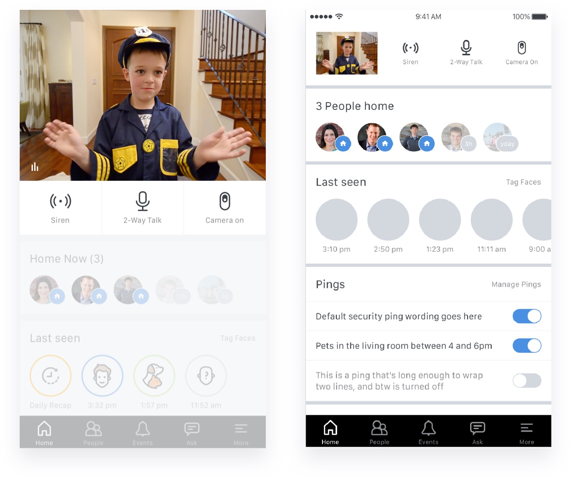
Through our studies we found that users perceived the livestream to be the most important feature. However in reality most times when you open the app it is unlikely to see any activity, unless you’re led there by an external trigger. For the perceived importance the stream was kept front and center in the UI, but several experiments were conducted on how to reduce the stream real estate upon interaction with other elements on the screen.

61%

of respondents purchased primarily for home security reasons. Close second is general peace of mind.

63%

considered the livestream the most important feature to achieve that goal.

Homescreen UI featuring variations of livestream layout

Confidence in Lighthouse

Customising external triggers

Providing triggers that are not only accurate but also relevant to the user, provides a great opportunity to build trust. By allowing the user to set their own triggers and letting them know how these are interpreted is integral.

Understanding what the system understood

One of the major challenges of the open-ended NLP input is making it clear to the user how the system interpreted the input. Storing only the interpreted input or the user input, lead to disconnects and misunderstandings.

Designing for versatility and scale

Building a component library

In order to build things fast, but also change fast, my intent from the start was to ensure that everything was designed in a way that meant symbols could easily be reused and adjusted. For every new flow designed I’d pull from existing components to furthest extent possible.

Not only did this lead to predictability for both users and developers, but also allowed flexibility as certain standardised measurements for paddings, margins, fontsizes, etc were stored as variables and could be changed on a large scale.

Designing with representative data

Populating designs

By using plugins such as Craft for Sketch, we ensured the designs were populated with representative data. By maintaining appropriate datasets designs and flows can quickly be visualised with representative data to make sure the designs work in more realistic contexts as well.

Understanding the visual impact of difference between 3 and 4 faces per row.

Post-launch

Adjusting the homescreen to new learnings

As our app functionality continued to grow, there hadn’t been a time to sit down and re-evaluate the status quo. Among users who were more actively engaging with our NLP system we were seeing better feedback, therefore we wanted to rethink how it could be integrated as a more central part of the app design.

Prototypes of various layouts with more or less emphasis on the NLP search interface

Say Hello

I'm always interested in exciting new prospects, or just talking design.
Feel free to get in touch!